Wednesday, October 31, 2012

Field Journal 5


Field Journal 5
Ukiyo-e


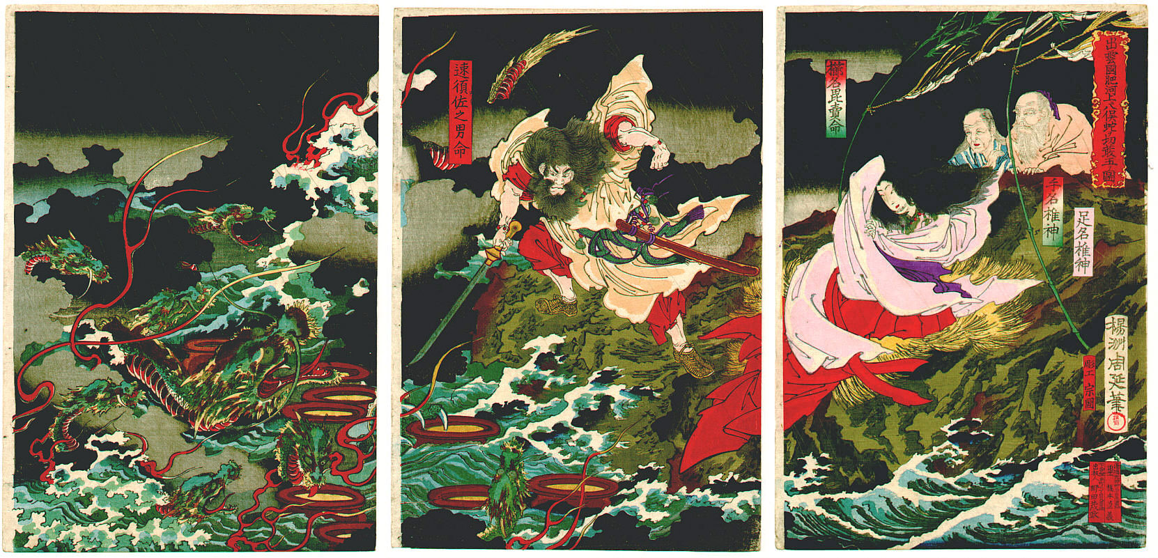
          Ukiyo-e, (translated as: "pictures of the floating world") an art movement that began in the early Edo period that combined the realistic narratives told in emaki (traditional picture scrolls) with influences from the decorative arts. Looking into this style reminded me of all old Japanese myths and stories that I use to read, like Susanoo fighting the 8-headed serpent Orochi to the death and pulling out the sword Kusanagi from one of its tails. I like the bold colors and clean lines of the illustrations. I enjoy the woodblock tryptychs and marvel how each panel can stand on its own in artistic merit.


 Yotsuya Kaidan, the story of Oiwa's ghostly revenge on Tamiya Lemon, who gradually descends into madness.


Personally I like the color and detailing of the landscape in some of these. This is typical of the thoughts and culture of Japan in that everyday is a journey and it is ever-changing and flowing. Impermanence is also a Buddhist basic belief which reflects in the life of people in Japan, culturally. 


I also like the ones with that have a lot of things going for it, like the depiction of battle scenes, with big groups of samurai in armor, wielding their katana along with other exotic weaponry in a huge epic battle.


It was amazing to discover how much Art Nouveau  took great influence from Ukiyo-e. Both are asymmetrical, use an outline and employ bold colors and are simple but detailed and very nice to look at. I would have never realized this if I hadn't enrolled in this class.


Pictures from:

http://www.sobi2pallas.jp/png/ukiyoe/181hiroshige-2.jpg

http://4.bp.blogspot.com/_9i4NSdp0BwI/TKBqvhUXQsI/AAAAAAAABO4/YmqP0Xop84Q/s1600/280.JPG

https://blogger.googleusercontent.com/img/b/R29vZ2xl/AVvXsEhOuIP6dplbTn5LPqBGSMI1NCPB4-VhmTs5tOISzj1Bxv3nkjrkkPeBLlCEwt2HlyWCzn8eVmYDbnwkrOAiu2OUjBn19irP0Sk4uyMOo1A2btb1fJ4QgD-hvgk5AOI_eOXqNAnYsnAdAO7D/s400/yotsuya1.jpg

http://upload.wikimedia.org/wikipedia/commons/8/83/YamataNoOrochi.jpg

http://cerriousdesign.com/images/nouveau11.jpg

Wednesday, October 24, 2012

Field Journal 4


Field Journal 4
Lecture - Arts & Crafts Movement Review


          One of the things that really caught my eye about this lecture was the Industrial Revolution's production of cheap and inferior products for sale on the market and how machines and manufacturing pretty much removed the artist from the production process altogether. Most of it was formed from cheap labor rather then a traditional system of apprenticeship, where people actually learned how to be artists who can put together quality work that they can take pride in.


Now in our modern day era there are a countless number of manufactures that strike a balance between quality and quantity where the artisan actually has input in production. But one of my favorite examples of this comes from a sword manufacture called Hanwei. Formed by Paul Chen, Hanwei is a GIANT in the industry and is my preferred favorite as far as the sword industry goes. In his company, Chen actually supervises a team of 35 skilled smiths who in turn supervise 4 times the number of assistants in the forge. There, everything is done traditionally only with power hammers and modern materials at their disposal. So there, the machine doesn't replace the artisan but instead aids him in production, so he doesn't have to compromise quality for quantity.


  Since mass produced items at the time were cheap and crudely made, artists were at odds with the innovators most of the time because of the cheap production value of the products. This eventually led to the Arts and Crafts movement which were composed of a number of societies and guilds with the common goal of promoting the importance of maintaining quality and their craft. in today's society there will always be levels of varying quality. From cheap mass-produced, to middle quality, to the high-end quality products that will of course reflect in the high price tag.


By: Kevin Young


 References:

Tuesday, October 16, 2012

Field Journal 3

Field Journal Module 3
Chapter 5-8 Review


          In chapter 6 of Megg's History of Graphic Design, it mentioned that after many printed editions of the Bible made increased study possible. Therefore, people in Europe developed their own interpretations of the Bible instead of relying on religious authority. Many Christian sects were developed from this and followers chose which one fit their ideals the best. This was disruptive to religious authorities because they no longer had control of conformed religious thinking. I found this interesting because before we could print books in quantities we were unable to spread different opinions or new theories efficiently. Therefore, with this invention and the use of graphic design\typography we were able to spread information and inspire further thinking.

          Because of the ability to mass-produce literature, it was hard to keep up with the accurate content of the publications. Which .......ha ha... coins the phrase "Trust me, Wilbur. People are very gullible. They'll believe anything they see in print." (quote by E.B. White from Charlotte's Web). Therefore, there was more ability to spread the word around, but harder to monitor the credibility of who wrote it. This is where I elude to how my family was directly effected by something that was put into bold print. You see, my grandparents are Americans of Japanese ancestry. During WWII after the bombing of Pearl Harbor, William Randolph Hearst was the owner of the San Francisco Chronicle. He published his newspaper with the headline "OUSTER OF ALL JAPS IN CALIFORNIA NEAR!". This fostered further anti-Japanese sentiment which was popular at the time and also sold a lot of newspaper. Shortly afterwards my grandparents experienced a forced evacuation and eventually ended up in a relocation camp in Topaz Utah. So people like to believe what they see in print, this headline was both popular and reflected the sentiment at the time and promoted mass hysteria among American citizens. My Grandparents were American citizens who were wrongly
interned because of their ancestry. This points to how seeing in print directly influences the masses whether right or wrong. Simply, they will print anything if it makes money.

          This made me realize how important the invention of typography was to our ability to spread information throughout civilizations. Knowledge and literacy spread quickly this way and allowed people to express their opinions, facts, fiction, and propaganda with greater ease.

By: Kevin Young
10/16/12

Pictures from:

http://www.google.com/imgres?um=1&hl=en&sa=N&biw=1366&bih=643&tbm=isch&tbnid=tzIWLpysi3O3wM:&imgrefurl=http://www.bookmice.net/darkchilde/japan/camp.html&docid=t_aGz45jcVTPDM&imgurl=http://www.bookmice.net/darkchilde/japan/japan/sign.jpg&w=401&h=310&ei=hDx-UOynD4yE8QT92IGQCA&zoom=1&iact=hc&vpx=414&vpy=333&dur=361&hovh=197&hovw=255&tx=137&ty=163&sig=109623133607132974756&page=1&tbnh=147&tbnw=201&start=0&ndsp=18&ved=1t:429,r:14,s:0,i:114

http://www.google.com/imgres?um=1&hl=en&sa=N&biw=1366&bih=643&tbm=isch&tbnid=HjAQscz_tmp1FM:&imgrefurl=http://www.sourcewatch.org/index.php/Japanese_American_life_under_U.S._policies_before_and_during_World_War_II&docid=-Q5MxhrNTmPgZM&imgurl=http://www.sourcewatch.org/images/thumb/3/33/Yellowperil2.jpg/300px-Yellowperil2.jpg&w=300&h=246&ei=FTx-UKasBpCK9ASF_oHwCQ&zoom=1&iact=hc&vpx=330&vpy=306&dur=531&hovh=196&hovw=240&tx=84&ty=120&sig=109623133607132974756&page=1&tbnh=149&tbnw=174&start=0&ndsp=20&ved=1t:429,r:8,s:0,i:96


Tuesday, October 9, 2012

Field Journal 2


Field Journal: Module 2

Ch. 1-4 Review

October 9, 2012


Back in High school I tried to take Japanese and did alright... sort of. I memorized the Hiragana and Katakana fine, but when it came to the Kanji (Chinese characters). Memorizing them, let alone trying to write out some of the characters in class was a hassle, because they looked so complex. Well high school is over for me, and I barely remember just what I've learned from taking Japanese. So why do I bring this up? Because one of the chapters talks about the history of Chinese writing (where Kanji originated), and I read this hoping to get a better understanding of it, since I crashed and burned trying to memorize Kanji the first time around.

Like many other languages, it seemed that Chinese writing evolved from a non-linguistic symbolic system (a.k.a pictograms).   


The above pictograms are examples found on the Oracle Bone, which was the first evidence of the beginning of Chinese writing. So, going back to Japanese, there were at least 3 main alphabets I had to learn, which were Kanji, Hiragana, and Katakana (all of which were mentioned at the top). Hiragana is basically simplified Kanji used for the native language, and Katakana if i remember correctly from my class, is used to pronounce non-Japanese/Chinese words, like my name Kevin, or McDonalds. Lastly, Kanji in the Japanese alphabet consists of about one thousand characters. All three types of writing are found in written text and literature, with Kanji being usually very complex. Often you would find Hiragana being written next to the Kanji to decode it. Of course when you translate both the Japanese and the Chinese characters, they both have the same meaning, however the pronunciations are completely different. 

hiragana chart
Kanji

Basically, Asian languages had evolved out of the Chinese characters, only simplified for ease of use, which increased literacy, and adapted cultural differences. I'm of both Japanese and Chinese descent, so this section of the book interested me because of that. I still want to learn more about Japanese, and hopefully get Kanji down soon. I like this section of the book a lot because it rekindled my interest in learning Japanese.

Monday, October 8, 2012

Field Journal 1


Field Journal: Module 1

My First Impressions

October 1, 2012


Well, where do I begin? At first, I found Megg’s History of Graphic Design to be a little overwhelming, but at the same time thought provoking. There were so many different art styles for me to wrap my head around. Simply put, I found that each picture had a common theme to them, which was to grab the attention of the viewer and to communicate something.

From the early petroglyphics, which told the story of life, to the WWII era propaganda, depicting Hitler, death. I can’t read German but it still conveys a very dark message. I also have noticed that the pictures in here are well proportioned and aesthetically pleasing the eye, even though you may or may not agree with the message at all.

This book shows many examples of symbolism and how powerful it is as a tool in graphic design to easily elicit emotion or to quickly relay something to its audience.
 I personally like the Japanese flag because its so simple and easily recognizable. The symbol of the rising sun is so powerful, that just a glance would be enough to know it represents Japan or something Japanese. The same is true for the American flag. You feel a sense of comfort, allegiance and pride. In this book It also shows logos and how powerful they can be. For instance, the book showed the General Electric and CBS Logos. But the two most powerful logos I can thing of have to be the Nike “swoosh” and the Apple logo.

In all, this book represents the of graphic design through time. Giving great examples of political, cultural, religious and popular trends with all the common purpose to relay a message or to communicate. It will be a great reference for me in the future.


Kevin Young